

Brand
WM
WM
UI/UX Design
Research
2019
WM was looking to improve the online shopping experience for customers in order to reduce cart abandonment, increase conversions and reduce call volume.
They noticed people who were shopping for containers would often abandon their cart after configuring their service options on the cart page. This resulted in very low conversion rates and customers would often call in afterwards and speak with a sales representative to order new service.
During my initial research and audit of the existing shopping experience, I noted all the issues that stood out to me as I went through the flow, many of which were later confirmed by other users during formal testing sessions.
• Clarity in pricing
• Ability to compare container sizes
• Configure dates and service options
• Container and service details
• More user friendly interface
• Increase conversions
• Reduce cart abandonment
• Create transparency in pricing
• Modernize the user interface
• Boost user confidence
Before any design work could be done, we needed to gain insights into the issues people were having with the current shopping experience.
Working with UX researchers, we set out to try and find out why people were abandoning the cart page and not completing their purchase. The research team conducted interviews and moderated testing sessions with existing WM customers as well as non-customers in order to get live feedback as they were going through the existing e-commerce flow.

Testing the existing e-commerce flow
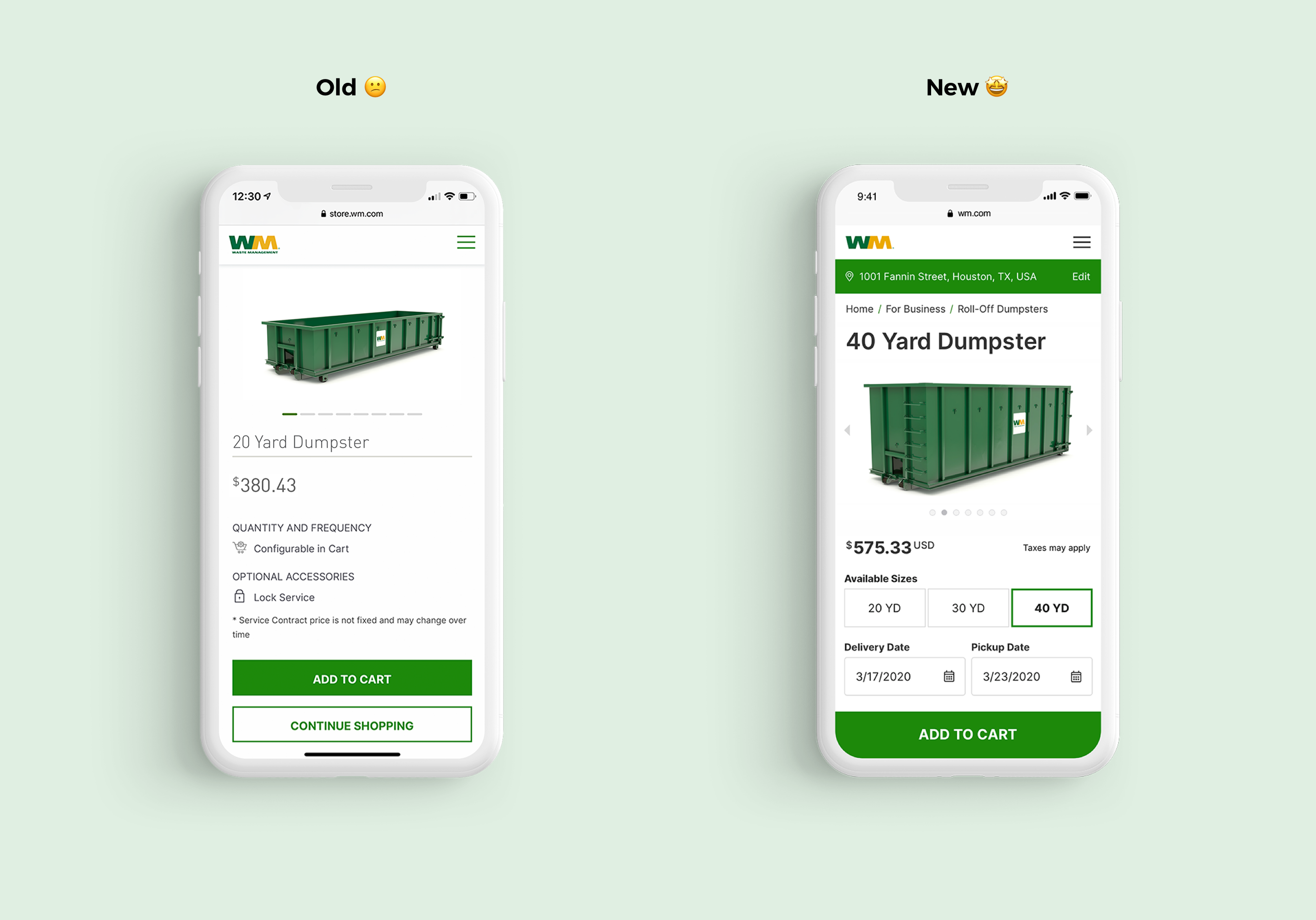
One of the major issues people were having was that they would see a price increase when the container was added to the cart. This was because additional costs such as fuel, taxes, environmental charges, etc… could only be calculated on the cart page. It was a limitation of the current systems in place as the product listing page and cart page were on two different platforms. We would need to figure out a way to bring that pricing information from the e-commerce platform into the product page.
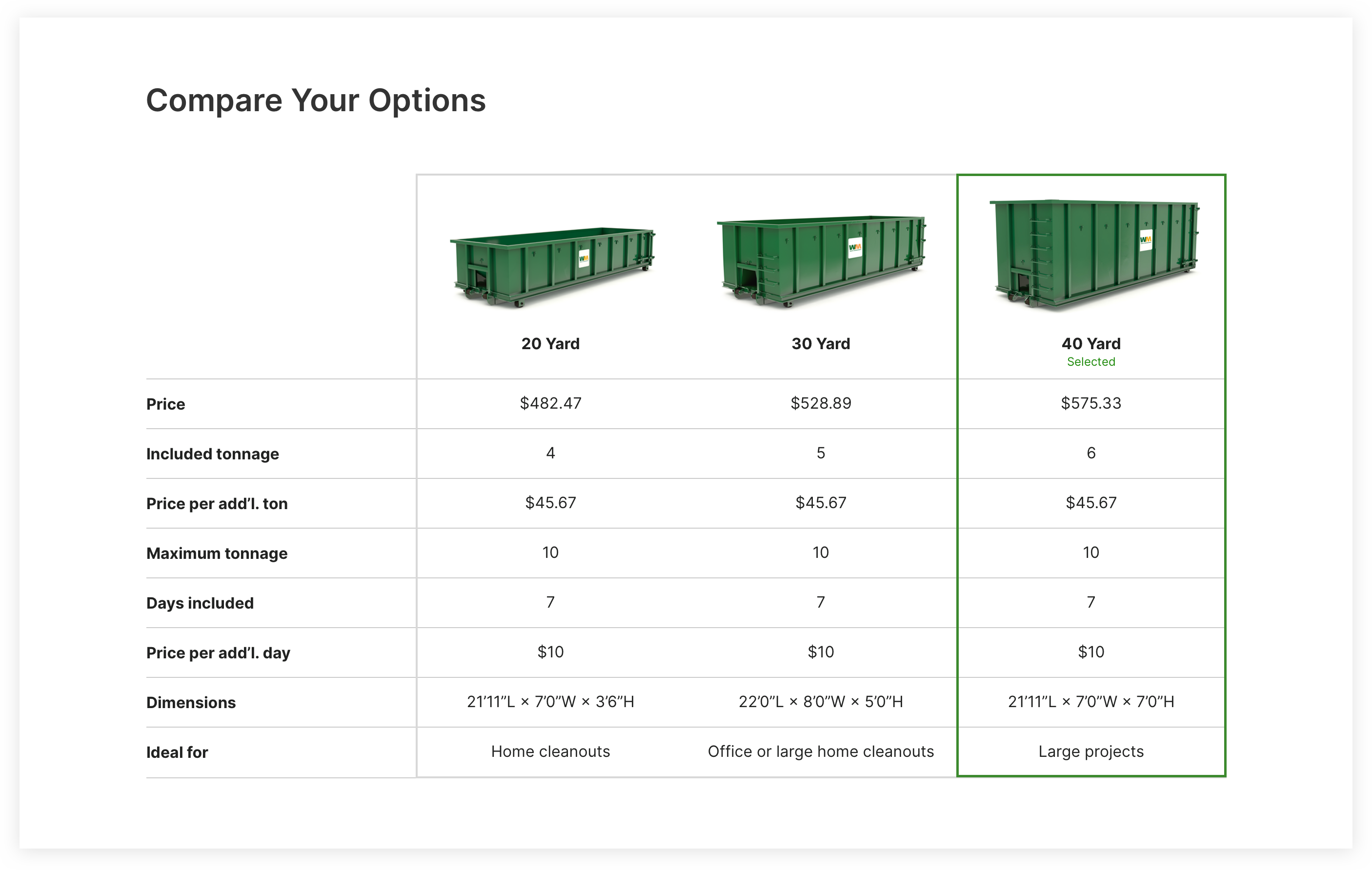
Users also wanted to compare pricing with a different size container. In order to see total pricing for a specific container, a user needed to add the container to the cart and configure the service details (delivery date, pickup date, waste type) on the cart page. Comparing total pricing with a different size container was not possible because the additional charges for both/all containers (fuel, taxes, etc…) would all be added together on the cart page.
To see total pricing for a different container, you would have to remove the current container from the cart, go back to the product listing (results) page, add a different container to the cart, and reconfigure, all while trying to remember the pricing and configurations for the previous container. It was a very bad experience and not user-friendly.
Problem 1: Users could not see total pricing until container was added to cart.
Problem 2: Configurations that affect pricing could only be done on the cart page.
Problem 3: Users could not compare pricing with other containers.
Problem 4: Not enough product and service details to inspire confidence in the buyer.
Working closely with back-end and front-end developers, the dev team was able to develop APIs that allowed us to bring a lot of the cart page functionality to the product page so users could get more accurate pricing details and compare different size containers without having to leave the page. We believed this approach would provide a much better online shopping experience and inspire confidence in the buyer when moving forward to the cart page.
However, before we could take users to the product page, we would still need an address to check service availability for that area. In order to collect this information and give the user more accurate pricing on the product page, we decided to create a quick questionnaire in the form of a wizard tool that made the process feel simple.
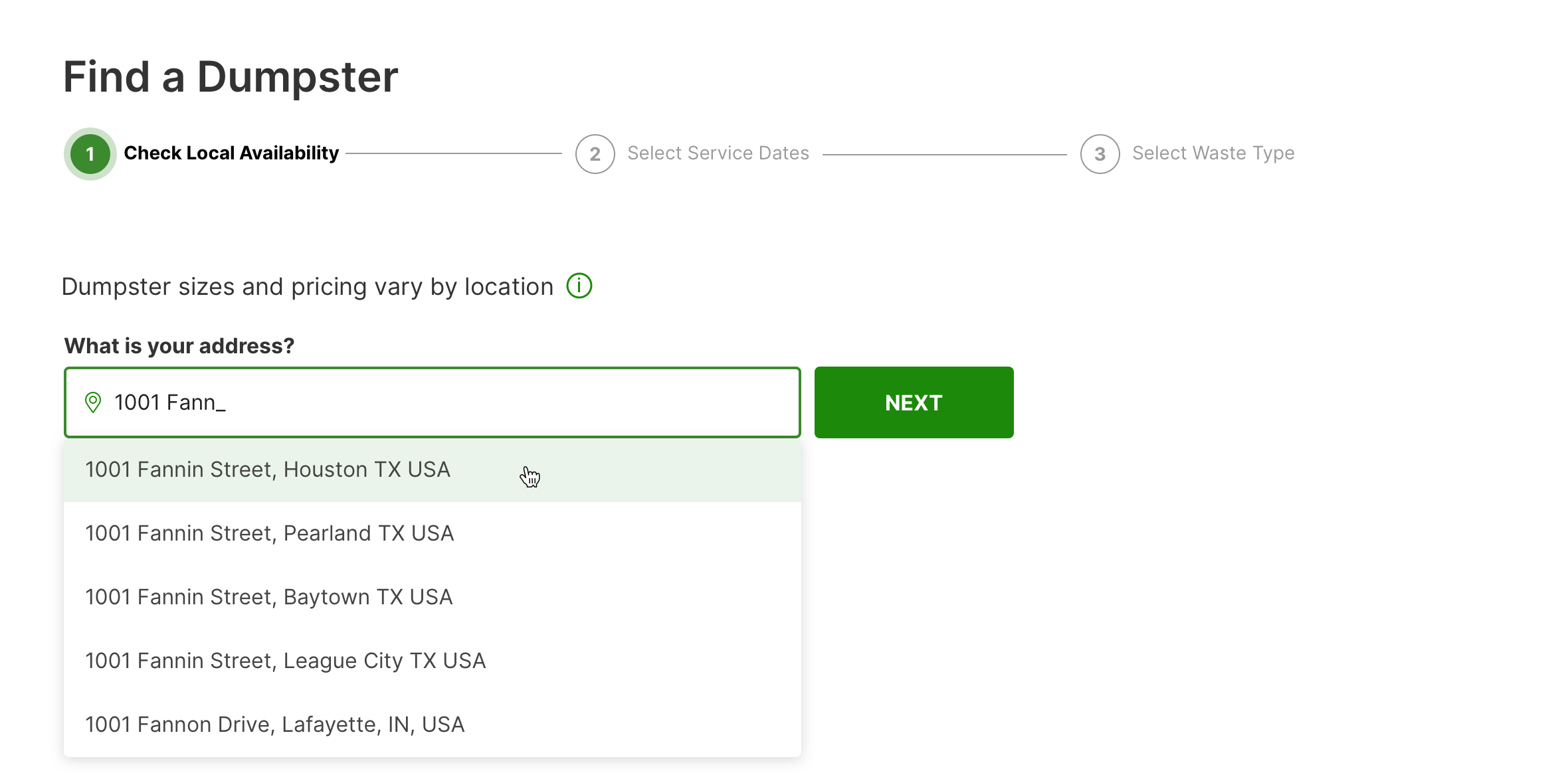
Checking Service Availability
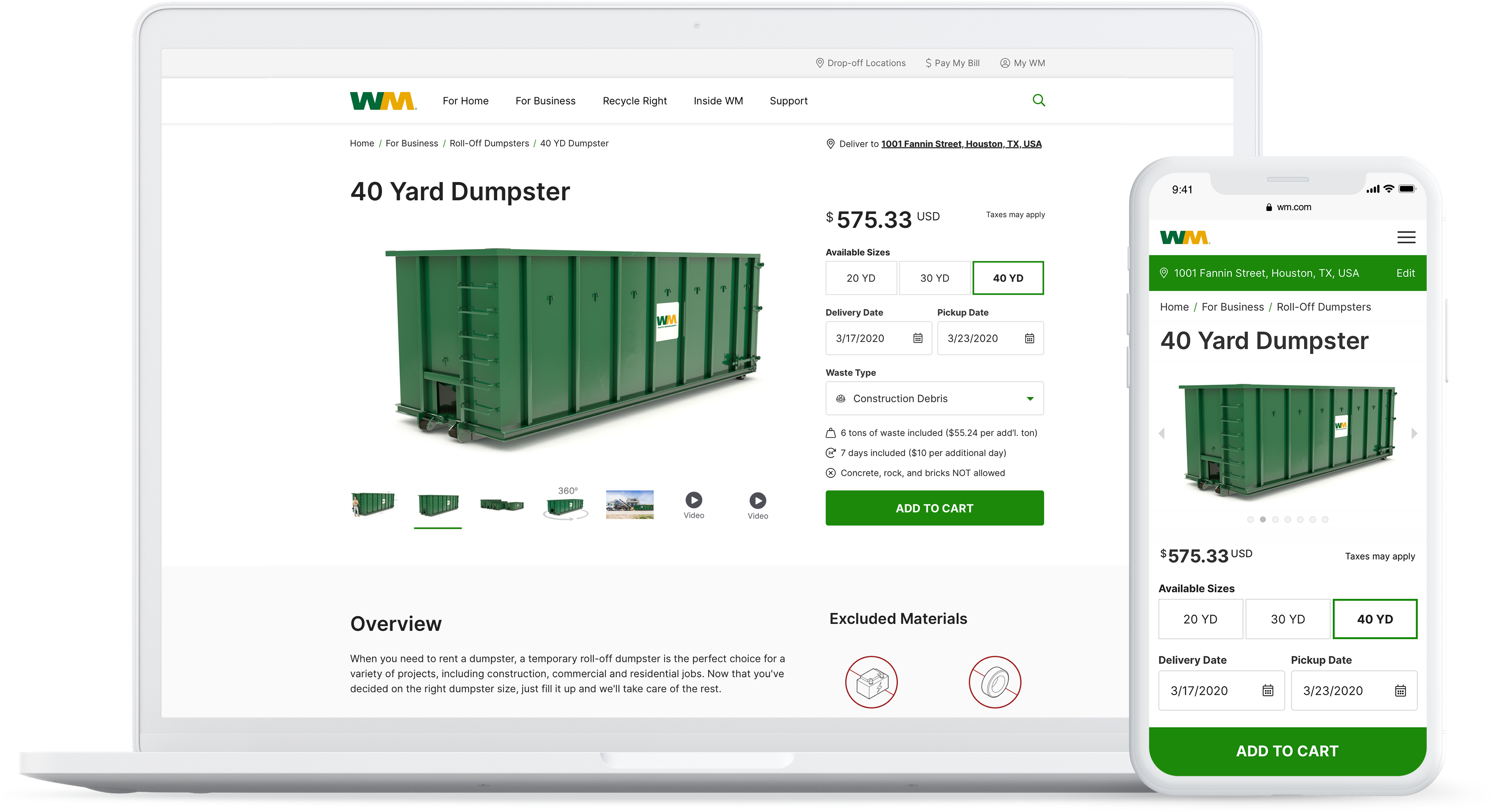
The redesigned product page beautifully displays available dumpsters for a given address. Users could now toggle between different container sizes and see the updated price without having to leave the product page. Changing the delivery and pickup dates and, depending on your service location, waste type would also update the price and additional information accordingly.
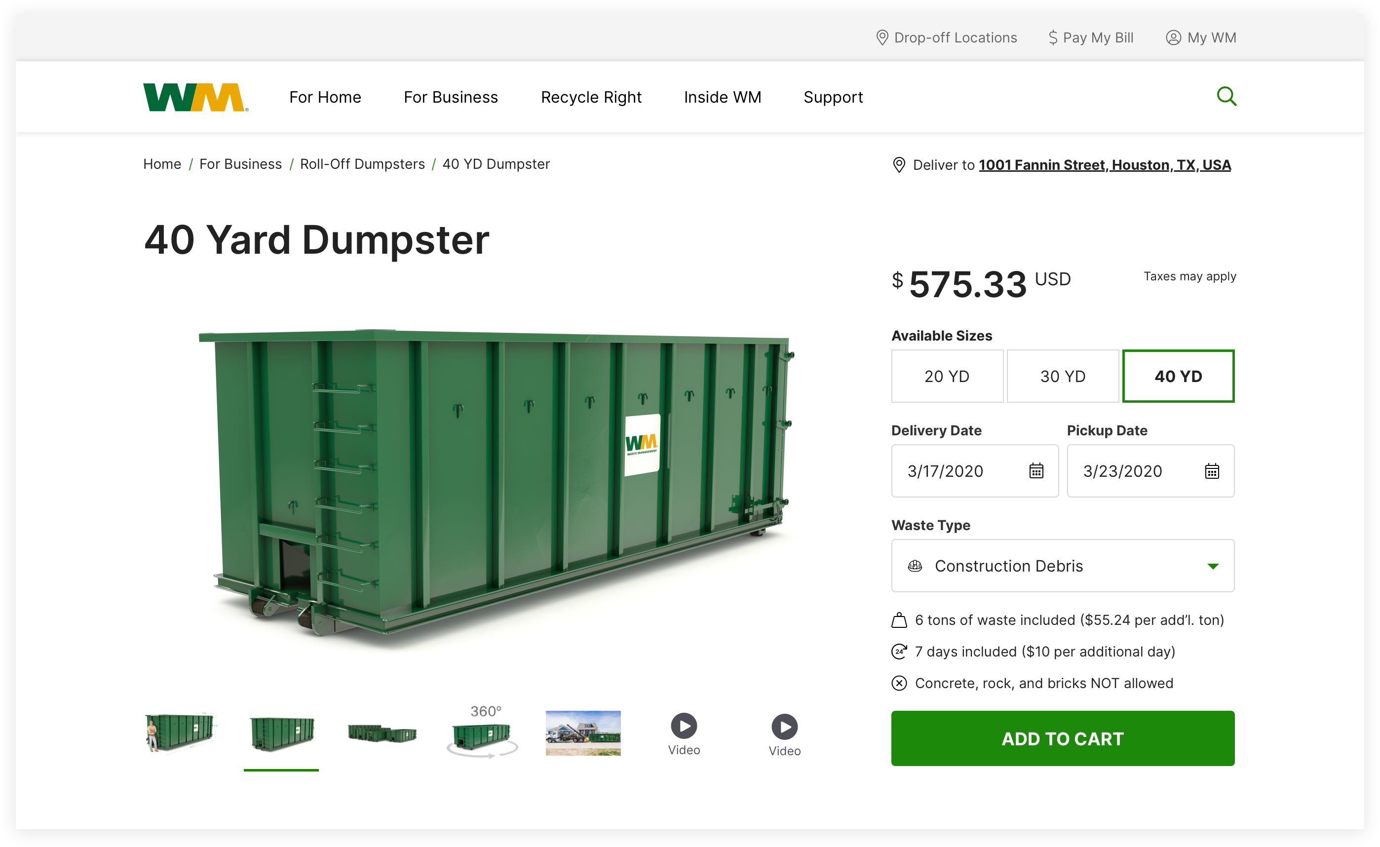
New Product Page / Available Dumpsters
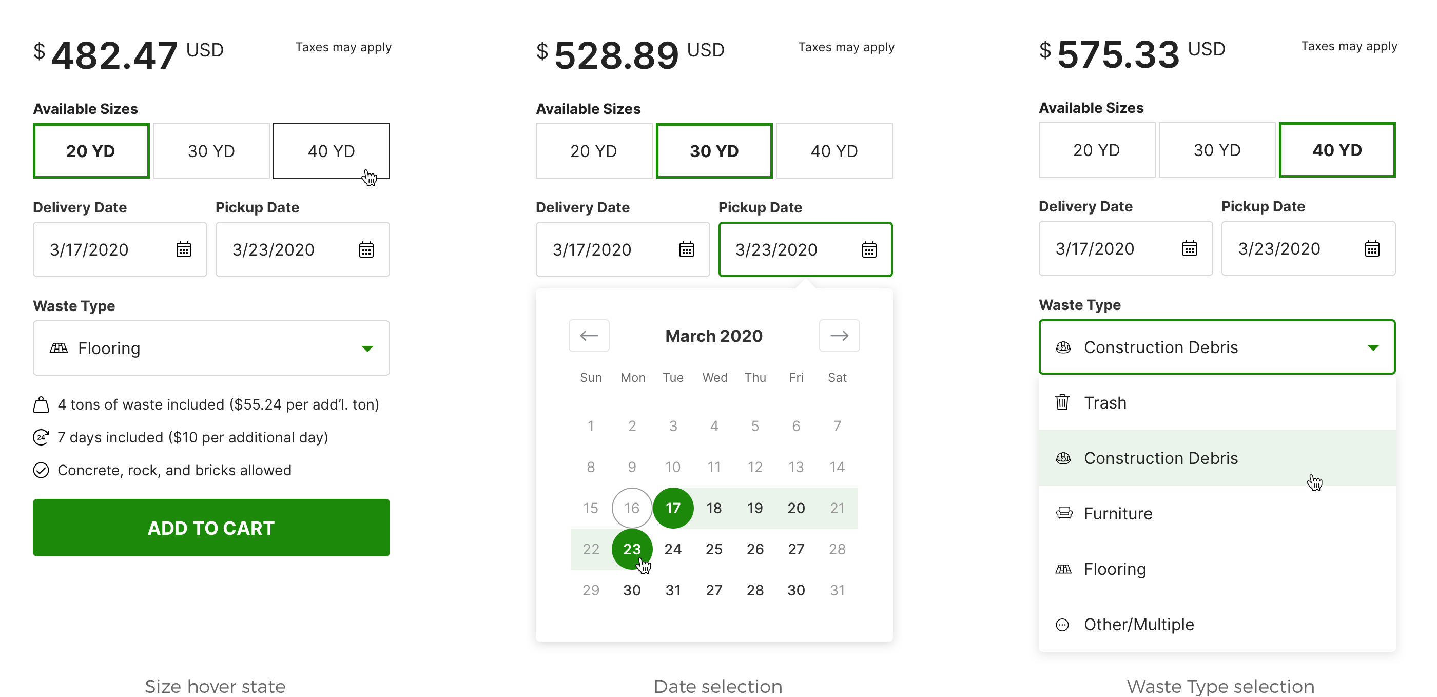
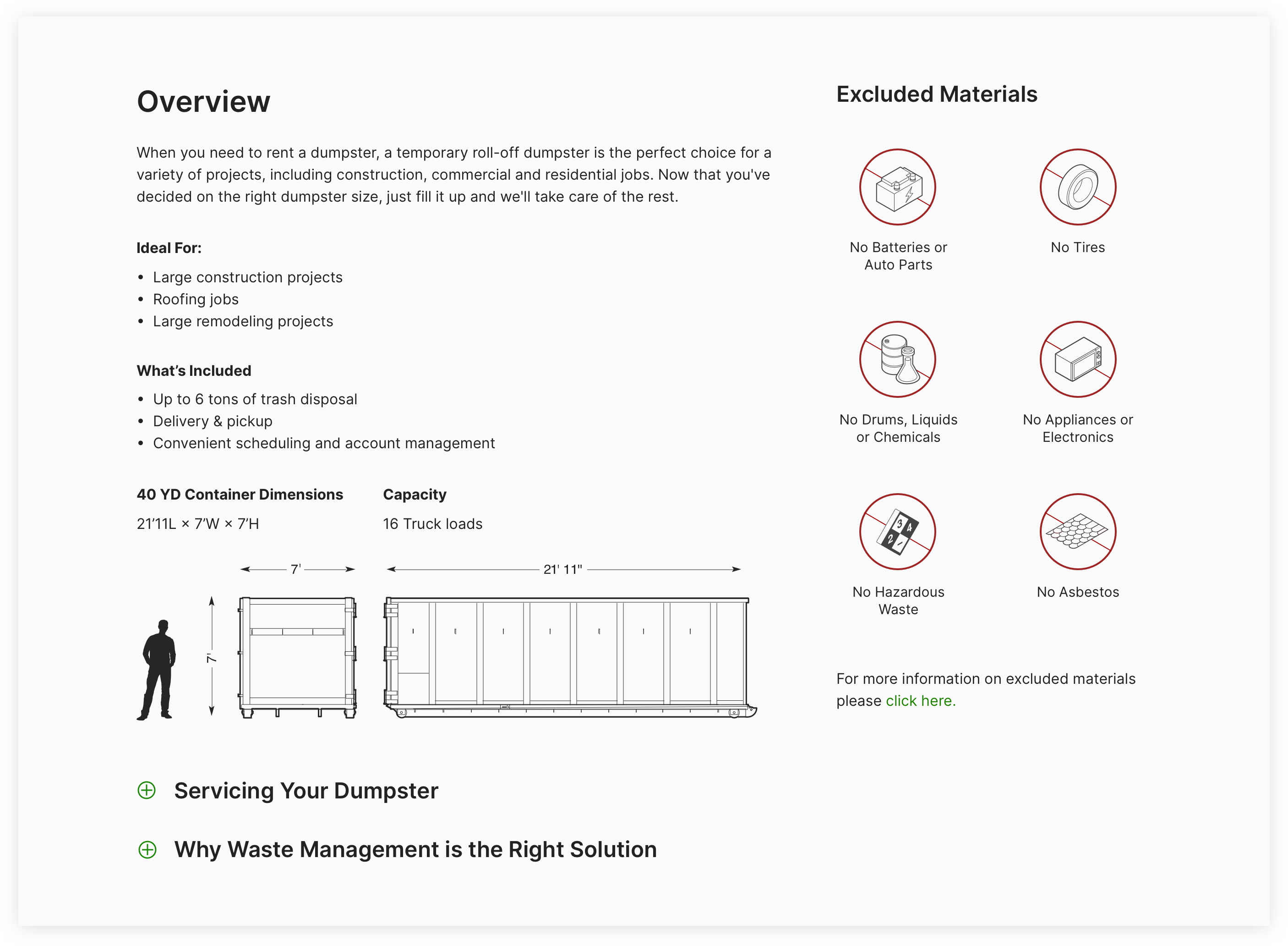
It was important to include more product and service details to reduce call volume and boost user confidence when making a purchasing decision. With the inclusion of detailed technical illustrations and container dimensions, users could get a better sense of scale of the container sizes and plan their site accordingly. The Excluded Materials section was also simplified with iconography.
Users can now quickly explore their options and compare available container sizes.
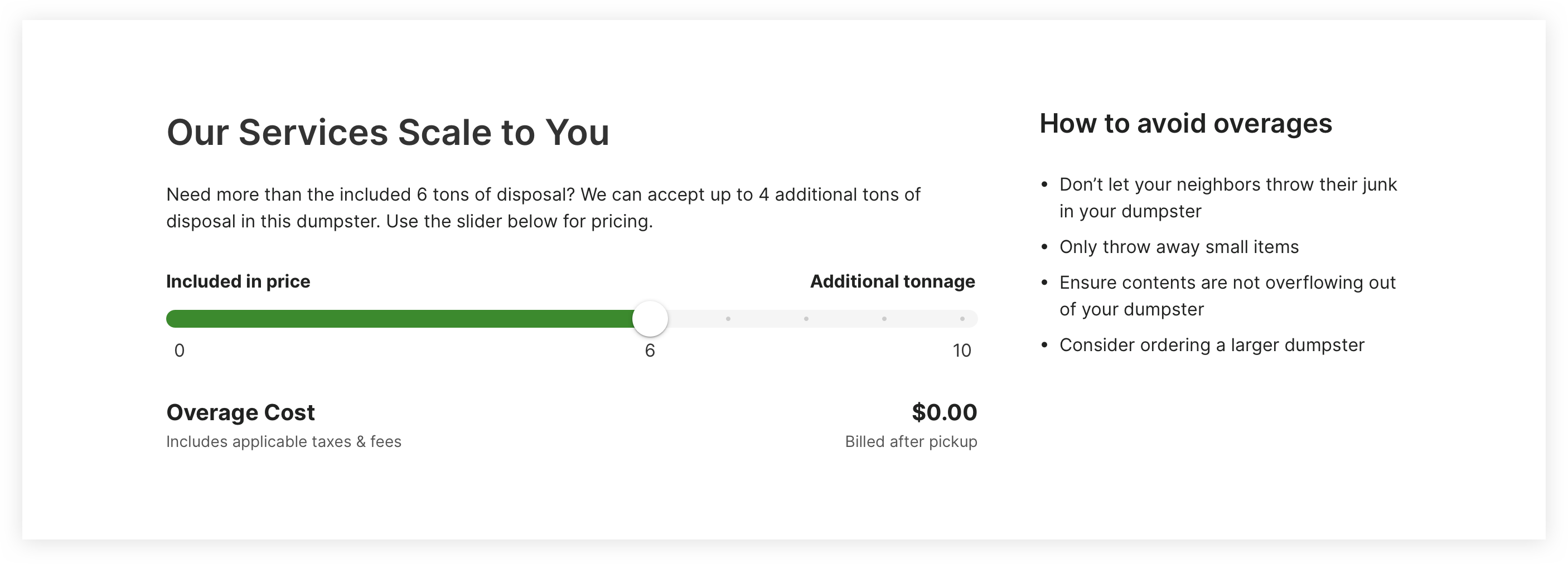
As a way to boost shopper confidence and create more transparency in pricing, an overage cost tool was created that gives users a better idea of what sort of charges they might expect to see if they were to go over the tonnage included with their container.
The product page redesign was hugely successful. We were able to create a delightful experience for customers which resulted in a significant increase in online sales.
Increase in conversions
Reduction in cart abandonment
Increase in traffic
Growth has continued since the redesign and the business is now looking at applying similar strategies across all product pages for all lines of business.