
Brand
WM
WM
UI/UX Design
Research
2020
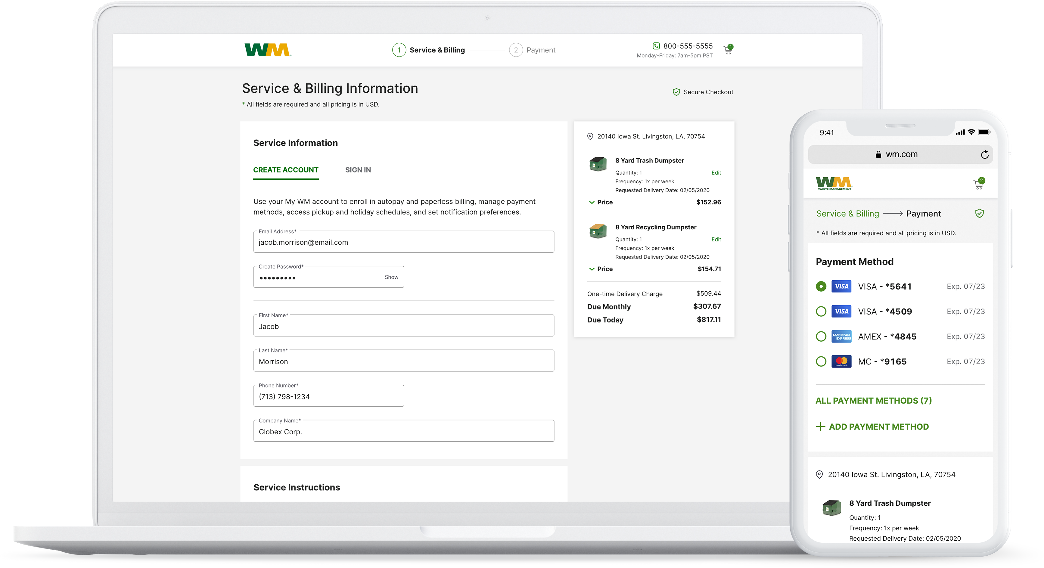
New user service & billing and mobile payment screen
Continuing our efforts in improving conversions and providing a better online shopping experience for WM’s products and services, the checkout flow was my next major project. This was also an area where people would often abandon the page and in dire need of a redesign.
I worked closely with the product owner, pricing manager, legal and operations in order to gather all requirements necessary for each customer type and line of business.
The existing flow felt very dense, confusing and overwhelming and just structured very badly. It was broken down into 4 steps, Service & Billing Info, Order Review, Payment Info and Order Confirmation. I felt this was unnecessarily too long of a process for a checkout flow. The interface also suffered from not utilizing basic usability principles.
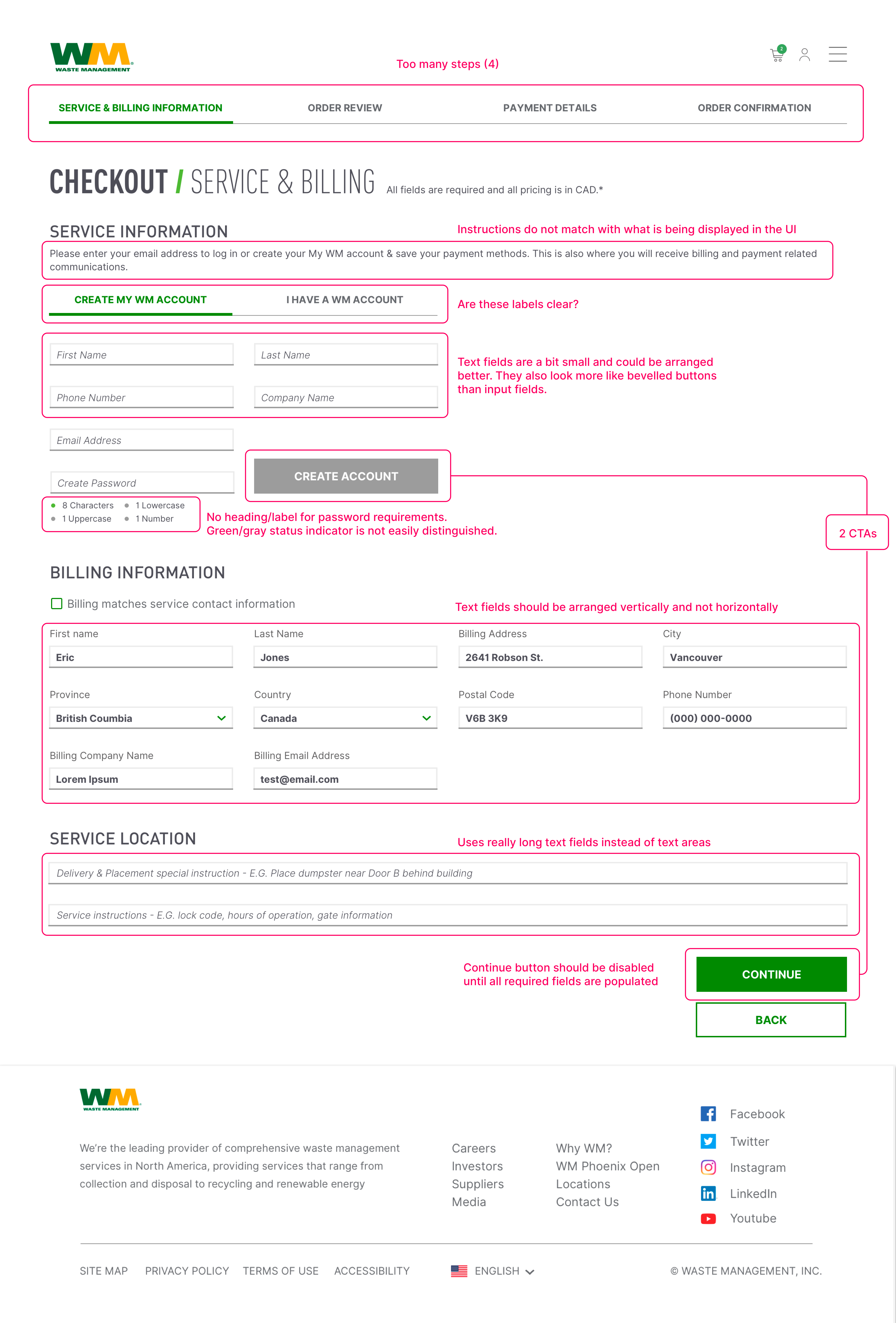
Examining the interface and judging its compliance with recognized usability principles.


Steps 2-4 in the old flow
I was able to condense the checkout flow down to two simple steps: 1. Service & Billing Info and 2. Payment Information. The Confirmation page was taken out of the numbered steps but is still displayed after making the payment. The Order Review page was taken out completely because with the inclusion of the mini-cart on the right, a user can always review and make changes to their order/cart.
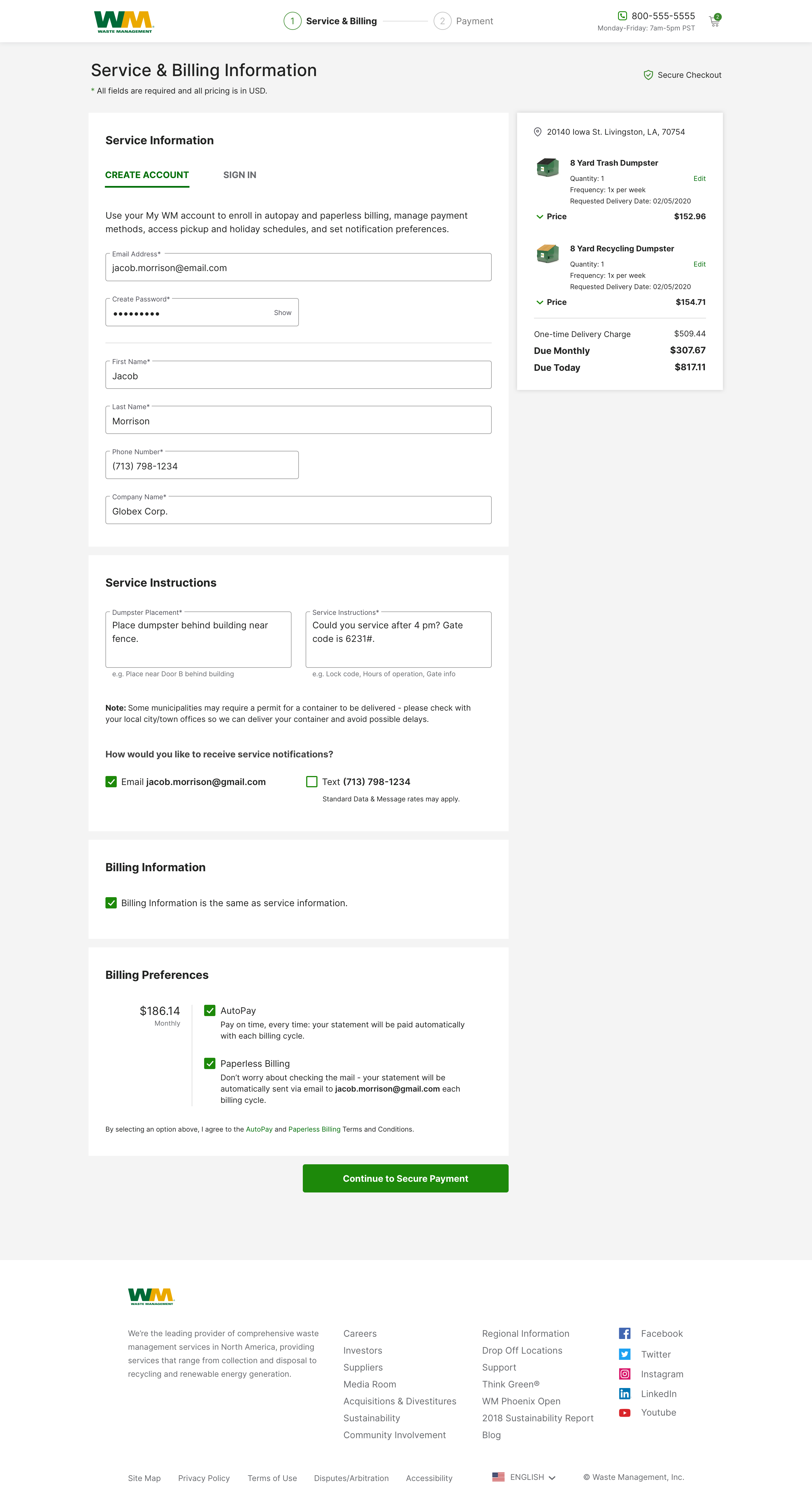
Redesigned checkout flow (new user/create account) with greatly improved usability

Logged-in user Service & Billing Info screen

Logged-in user payment info screen with saved payment methods

Payment info screen for new accounts (no saved payment methods).
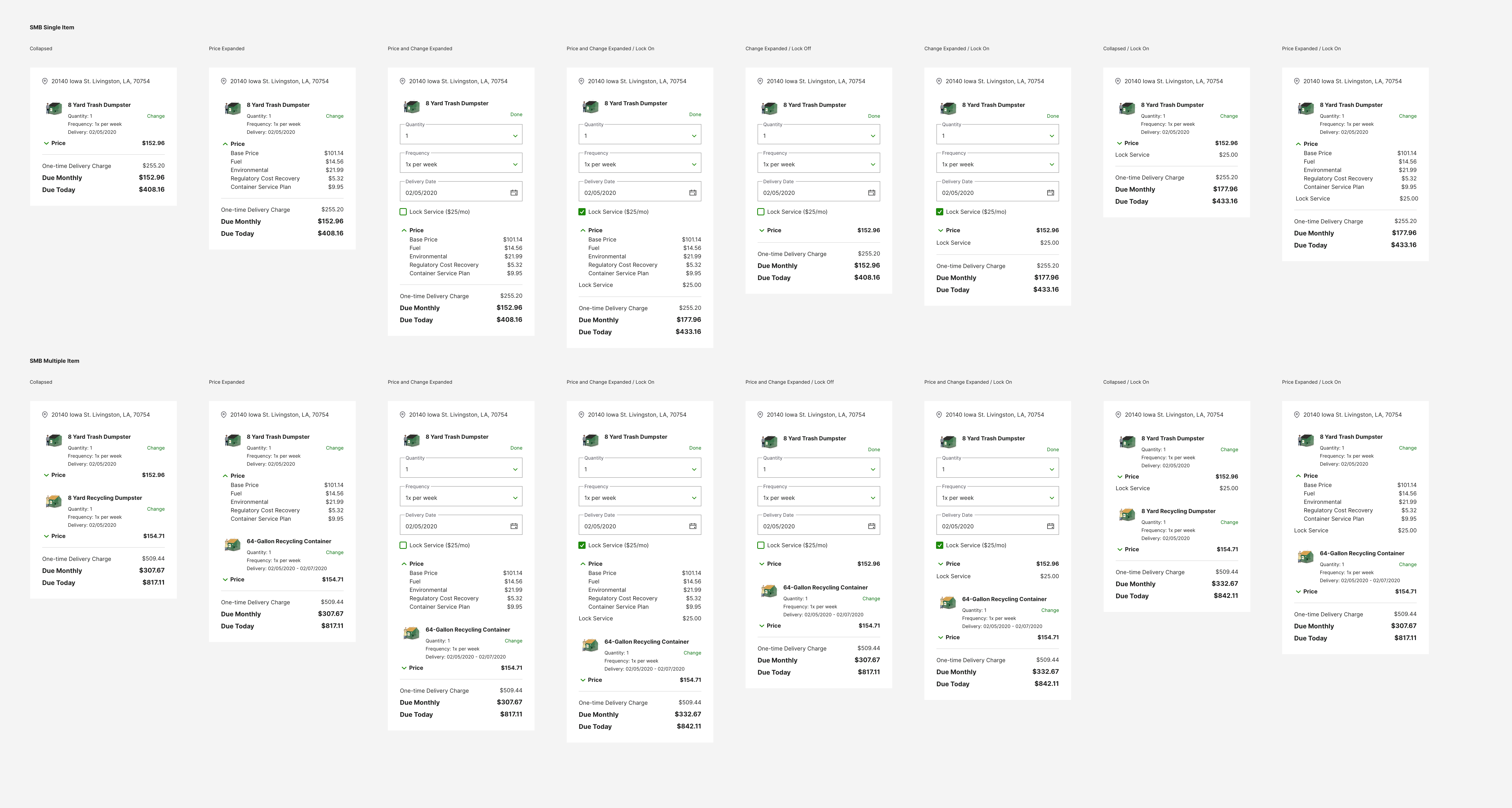
Minicart states – Commercial

Minicart states – Residential

Minicart states – Roll-Off dumpsters